

Mostrando postagens com marcador Design. Mostrar todas as postagens
Mostrando postagens com marcador Design. Mostrar todas as postagens
quinta-feira, 9 de fevereiro de 2017
quinta-feira, 17 de novembro de 2016
"Sai um estádio verde para o Reino Unido, pf!"
link via shifter
Depois do Brexit, vem a bonança. Ou não, mas vem aí um dos estádios mais sustentáveis do mundo pois será o primeiro (e totalmente) em madeira. Um projeto de Zaha Hadid Architects.
#bravo #but #Iwillnotforget #brexit

Depois do Brexit, vem a bonança. Ou não, mas vem aí um dos estádios mais sustentáveis do mundo pois será o primeiro (e totalmente) em madeira. Um projeto de Zaha Hadid Architects.
#bravo #but #Iwillnotforget #brexit

domingo, 17 de julho de 2016
Scrapwood furniture by Piet Hein Eek
"O designer Piet Hein Eek, de Eindhoven, diz que o mobiliário que ele começou a fazer a partir de madeira reciclada em 1989 destacou-se porque se mostrou diferenciado contra a uniformidade de outros produtos. Eek fez sua primeira peça de mobiliário usando pedaços de madeira, enquanto era ainda um estudante na Design Academy Eindhoven, na década de 1980."
via And This Is Reality
www.pietheineek.nl

via And This Is Reality
www.pietheineek.nl

terça-feira, 25 de agosto de 2015
Everything started with 35$
"The SWOOSH logo is a graphic design created by Caroline Davidson in 1971. It represents the wing of the Greek Goddess NIKE. Caroline Davidson was a student at Portland State University in advertising. She met Phil Knight while he was teaching accounting classes and she started doing some freelance work for his company. Phil Knight asked Caroline to design a logo that could be placed on the side of a shoe. She handed him the SWOOSH, he handed her $35.00. In spring of 1972, the first shoe with the NIKE SWOOSH was introduced.....the rest is history! "
Via Nike Consumer Affairs packet, 1996

Via Nike Consumer Affairs packet, 1996

quinta-feira, 20 de agosto de 2015
StDamo illustrations
Este ilustrador chama-se Stravros Damos e nasceu em 1977, em Thessaloniki. O resto não interessa basta ver o trabalho dele.
"I see the subject as a sculptor... I brake the forms, and illustrate them with line strokes. I'm trying to achieve a 3d feel..."
via National Traveller


"I see the subject as a sculptor... I brake the forms, and illustrate them with line strokes. I'm trying to achieve a 3d feel..."
via National Traveller


domingo, 9 de agosto de 2015
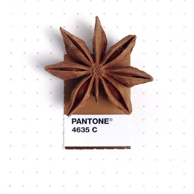
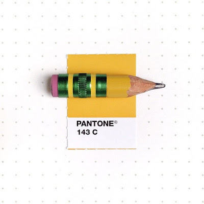
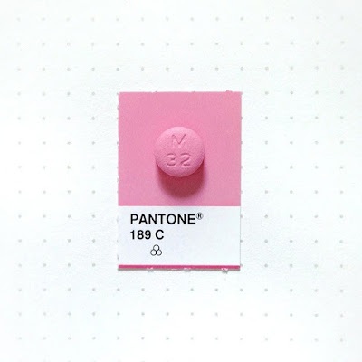
Tiny PMS Match
Well, here is a simple and creative idea that I could have had but I didn't.
So, thank you Inka.
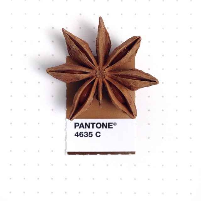
"A personal project of tiny proportion—matching small everyday objects to their Pantone® Matching System colors, by designer Inka Mathew. All pictures were taken with her iPhone 5 and edited with Snapseed."
Via her Tumblr
"I was mesmerized by very bright blue little flowers in my front yard. It’s called Georgia Blue", she says about the initial idea behind it. Ever since she first started the project in 2013, it has evolved into her "life visual journal" with some personal stories: if it's her husband's cholesterol medicine with the same pink blush of Pantone 691 C or her favorite comfort food Ramen noodles which pair perfectly with Pantone 7499 C.
Via Ignant



So, thank you Inka.
"A personal project of tiny proportion—matching small everyday objects to their Pantone® Matching System colors, by designer Inka Mathew. All pictures were taken with her iPhone 5 and edited with Snapseed."
Via her Tumblr
"I was mesmerized by very bright blue little flowers in my front yard. It’s called Georgia Blue", she says about the initial idea behind it. Ever since she first started the project in 2013, it has evolved into her "life visual journal" with some personal stories: if it's her husband's cholesterol medicine with the same pink blush of Pantone 691 C or her favorite comfort food Ramen noodles which pair perfectly with Pantone 7499 C.
Via Ignant




sexta-feira, 7 de agosto de 2015

terça-feira, 21 de julho de 2015
Brand Colors
Designers....se me estão a ouvir, posso facilitar a vossa vida com um simples clique.
Hoje tropecei na internet num site chamado brandcolors.net, desenvolvido pelo designer e developer Galen Gidman. Basicamente, permite ter acesso aos códigos das cores oficiais (código hexadecimal) das marcas mais conhecidas por esse mundo fora e pode-se fazer download das mesmas em formato "swatches" para importar nos programinhos da Adobe. Opa!
De nada.

Hoje tropecei na internet num site chamado brandcolors.net, desenvolvido pelo designer e developer Galen Gidman. Basicamente, permite ter acesso aos códigos das cores oficiais (código hexadecimal) das marcas mais conhecidas por esse mundo fora e pode-se fazer download das mesmas em formato "swatches" para importar nos programinhos da Adobe. Opa!
De nada.

domingo, 12 de julho de 2015
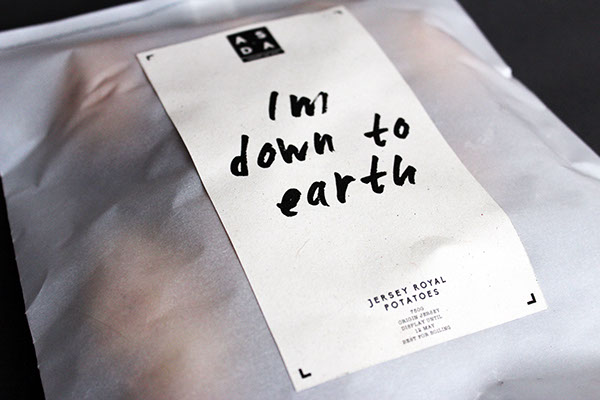
"Count on me" - ASDA redesign
Não sei porquê, mas aos domingos o meu apetite é sempre maior.
E com essa afirmação, não preciso de justificar este post. Aproveito apenas para dizer que este exemplo de packaging é muito bom. E mesmo sabendo que ninguém me perguntou nada, vou responder: "- Gosto por ter um design simples, com personalidade e elegante."
A conversa mais a sério vem a seguir com a explicação da designer.
For customers to have confidence in a product, it must have confidence in itself. So why shouldn’t a basic range, have some charm and engagement. One of the aims of this project was to make people smile when they see these products, using witty puns that relate to the food. Which will grab people’s attention and inject personality.
The idea behind the change of the logo, was to show the history of Asda and to show the partnership between Asquith and Dairies. Partnership and relationship became key words in the project, which also helped me come up with an appropriate name for the range ‘Count on me’. I felt this best represented, what it is all about and is in keeping with what a basic range provides. Which is a reasonable and reliable product at a small cost. Yet it still has that personal touch to the name.



sábado, 11 de julho de 2015
Vasos "origami" acompanham crescimento da planta
Growth, an innovative pot design inspired by the Japanese art of origami, grows together with your plant, expanding to accommodate more soil and a wider root network. This design, by the London-based duo at Studio Ayaskan, aims to make plant pots more sustainable than ever. “In nature, everything evolves, adapts, grows, blooms, degrades, dies, gets absorbed, reused,” the designers, Bike and Begum Ayaskan, told Contemporist.
“The modern approach to building is the opposite. Here, things exist in stages: objects are produced, used, discarded… Growth, through it’s carefully calculated origami pattern, mimics nature’s ability to grow and transform by unfolding over time, bringing these qualities to the manufactured object.”
Fonte: Contemporist
www.ayaskan.com


“The modern approach to building is the opposite. Here, things exist in stages: objects are produced, used, discarded… Growth, through it’s carefully calculated origami pattern, mimics nature’s ability to grow and transform by unfolding over time, bringing these qualities to the manufactured object.”
Fonte: Contemporist
www.ayaskan.com


sexta-feira, 12 de junho de 2015
A sardinha emigrante.
Gostava de escrever um texto sobre esta minha ilustração, mas não consigo. Só me vem uma palavra à cabeça: saudade.
Fez agora 1 ano que troquei as ginjinhas pelas caipirinhas, até aí tudo bem. Agora, as sardinhas?? Valha-me nosso Senhor, mas não dá para trocar!

Fez agora 1 ano que troquei as ginjinhas pelas caipirinhas, até aí tudo bem. Agora, as sardinhas?? Valha-me nosso Senhor, mas não dá para trocar!

terça-feira, 9 de junho de 2015
Sofro de dromomania e não só.
Sofro disso e não é pouco. E não é muito...bastante até.
Descobri o nome hoje, mas os sintomas já os tenho desde muito cedo.
Resumindo, tenho a doença do viajante e espero que nunca tenha cura.
Meti-me na cabeça quando tinha 9 anos, durante a primeira viagem sem os meus pais para a Alemanha, que iria dar a volta ao mundo, pelo menos uma vez. Não ofereci qualquer tipo de resistência a essa ideia louca e cá estou eu com 32 anos a cumprir essa vontade cada vez que eu posso.
Tenho um mapa mundo gigante no meu quarto e não há melhor sensação do que riscar mais uma cidade onde já tive oportunidade de estar. Mas cada vez que olho para ele, normalmente quando me deito ou quando acordo - se não estiver atrasada - apercebo-me que ainda faltam muitos países, faltam muitas cidades. Segundo os meus cálculos (mentira, foi através de uma app) já viajei 14% do mapa. "Só????" pensei eu. Conclusão, a próxima viagem já foi marcada: New York. Hell yeahhhh baby! Esta viagem já estava na lista há anos e dia 24 de Julho pareceu-me uma óptima data para dar mais um rabisco no mapa.
Dei esta volta toda no assunto para dizer que ao ler este artigo interessante sobre "A World of Languages" percebi que talvez por eu ser dromomaníaca (?), que isso tens os seus efeitos secundários. Um deles é a de querer sempre aprender novos idiomas. Sempre tive interesse de entender e de querer comunicar na língua dos locais por onde viajo. A memória é que me tem traído ultimamente, mas isso seria assunto para outro post.
Ainda sobre esse mapa de línguas, só tenho uma coisa a dizer aos chineses:
- Menos, China. Menos.
Obrigado ao Jorge Teixeira pelo share do infográfico.
Link do artigo

Descobri o nome hoje, mas os sintomas já os tenho desde muito cedo.
Resumindo, tenho a doença do viajante e espero que nunca tenha cura.
Meti-me na cabeça quando tinha 9 anos, durante a primeira viagem sem os meus pais para a Alemanha, que iria dar a volta ao mundo, pelo menos uma vez. Não ofereci qualquer tipo de resistência a essa ideia louca e cá estou eu com 32 anos a cumprir essa vontade cada vez que eu posso.
Tenho um mapa mundo gigante no meu quarto e não há melhor sensação do que riscar mais uma cidade onde já tive oportunidade de estar. Mas cada vez que olho para ele, normalmente quando me deito ou quando acordo - se não estiver atrasada - apercebo-me que ainda faltam muitos países, faltam muitas cidades. Segundo os meus cálculos (mentira, foi através de uma app) já viajei 14% do mapa. "Só????" pensei eu. Conclusão, a próxima viagem já foi marcada: New York. Hell yeahhhh baby! Esta viagem já estava na lista há anos e dia 24 de Julho pareceu-me uma óptima data para dar mais um rabisco no mapa.
Dei esta volta toda no assunto para dizer que ao ler este artigo interessante sobre "A World of Languages" percebi que talvez por eu ser dromomaníaca (?), que isso tens os seus efeitos secundários. Um deles é a de querer sempre aprender novos idiomas. Sempre tive interesse de entender e de querer comunicar na língua dos locais por onde viajo. A memória é que me tem traído ultimamente, mas isso seria assunto para outro post.
Ainda sobre esse mapa de línguas, só tenho uma coisa a dizer aos chineses:
- Menos, China. Menos.
Obrigado ao Jorge Teixeira pelo share do infográfico.
Link do artigo

terça-feira, 12 de maio de 2015
2015: 25 years of Photoshop
I've just realised that I started to work with Photoshop a thew years ago.. like 15 years ago. At that time, it was the Adobe Photoshop 3.0. I don't know how do I feel about it.
The link below is a observation game to test your experience: can you tell if the images are Real ou Photoshop? I messed up in two. True story.


segunda-feira, 4 de maio de 2015

sexta-feira, 27 de fevereiro de 2015
Metaflop your font
Metaflop is an open-source web application for modulating your own fonts.
Have a nice and creative weekend!

quinta-feira, 26 de fevereiro de 2015
VAZU
Aprecio sempre o que se distingue pelo design, pelo detalhe e pela inovação.
Tive um desses momentos agradáveis ontem quando me apercebi que estava um objeto diferente à minha frente enquanto almoçava. Era um vaso, aliás era um Vazu. Calma, não me apercebi logo, porque não tinha flores dentro...
Criado por designers de Israel, o Vazu, quando ainda está dentro da embalagem, tem a espessura de uma folha plana e basta adicionar água para ganhar a forma de um vaso de flores. São vinte modelos com estampas diversas, em três formatos e tamanhos diferentes.
Eco-friendly, é todo feito de camadas de polietileno e materiais reciclados. Não quebra, não arranha, é lavável e reutilizável.
(Custa por volta de 50R$)


sexta-feira, 13 de fevereiro de 2015
"What is branding?"
With over 6,400 books written on branding, the subject has gotten complex. Yet simplicity is where the power exists.
This video was conceived, written and narrated by award-winning designer, branding specialist and Fast Company blogger David Brier to distill branding down to its basics answering that basic question "What is branding?" (from http://www.RisingAboveTheNoise.com )
Written plainly with equally minimalistic motion graphics, this video unveils the magic, the spark and the simplicity that is branding in its most fundamental form. Perfect for entrepreneurs, CEOs, innovators, rebels and disruptors of any kind. Motion graphics by the talented Saar Oz.
"As creators, we want to think it’s about us, our brilliant talent, our skills we’ve perfected over the years... "
This video was conceived, written and narrated by award-winning designer, branding specialist and Fast Company blogger David Brier to distill branding down to its basics answering that basic question "What is branding?" (from http://www.RisingAboveTheNoise.com )
Written plainly with equally minimalistic motion graphics, this video unveils the magic, the spark and the simplicity that is branding in its most fundamental form. Perfect for entrepreneurs, CEOs, innovators, rebels and disruptors of any kind. Motion graphics by the talented Saar Oz.
"As creators, we want to think it’s about us, our brilliant talent, our skills we’ve perfected over the years... "
quarta-feira, 4 de fevereiro de 2015
"Chocolatexture" made in Japan by Nendo
"In coming up with a new chocolate concept, we turned out attention not to such factors, but to the chocolate’s “shape.”
The 9 different types of chocolate are made within the same size, 26x26x26mm,
featuring pointed tips, hollow interiors, smooth or rough surface textures–
and, while the raw materials are identical, the distinctive textures create different tastes.
featuring pointed tips, hollow interiors, smooth or rough surface textures–
and, while the raw materials are identical, the distinctive textures create different tastes.
Each chocolate is directly named after Japanese expressions used to describe texture.
1. “tubu-tubu” Chunks of smaller chocolate drops.
2. “sube-sube” Smooth edges and corners.
3. “zara-zara” Granular like a file.
4. “toge-toge” Sharp pointed tips.
5. “goro-goro” Fourteen connected small cubes.
6. “fuwa-fuwa” Soft and airy with many tiny holes.
7. “poki-poki” A cube frame made of chocolate sticks.
8. “suka-suka” A hollow cube with thin walls.
9. “zaku-zaku” Alternately placed thin chocolate rods forming a cube."
2. “sube-sube” Smooth edges and corners.
3. “zara-zara” Granular like a file.
4. “toge-toge” Sharp pointed tips.
5. “goro-goro” Fourteen connected small cubes.
6. “fuwa-fuwa” Soft and airy with many tiny holes.
7. “poki-poki” A cube frame made of chocolate sticks.
8. “suka-suka” A hollow cube with thin walls.
9. “zaku-zaku” Alternately placed thin chocolate rods forming a cube."


quinta-feira, 29 de janeiro de 2015
Assinar:
Postagens (Atom)